from Shutter, by Lewis Collard
Since I'm planning on writing a small series on basic photo editing tasks in GIMP, I figured a good place to start would be with increasing a photograph's contrast. Here it is!
There's high-resolution versions of all the unaltered pictures here so you can run your own experiments and compare them against my results. Please feel free to download them, play with them and otherwise do whatever you see fit with them.
Don't use the Brightness/Contrast tool. It looks horrible. Technically, it works: it darkens dark areas to exactly the same degree that it lightens shadows. It also looks nasty done this way, so don't do it. Try one of these methods:
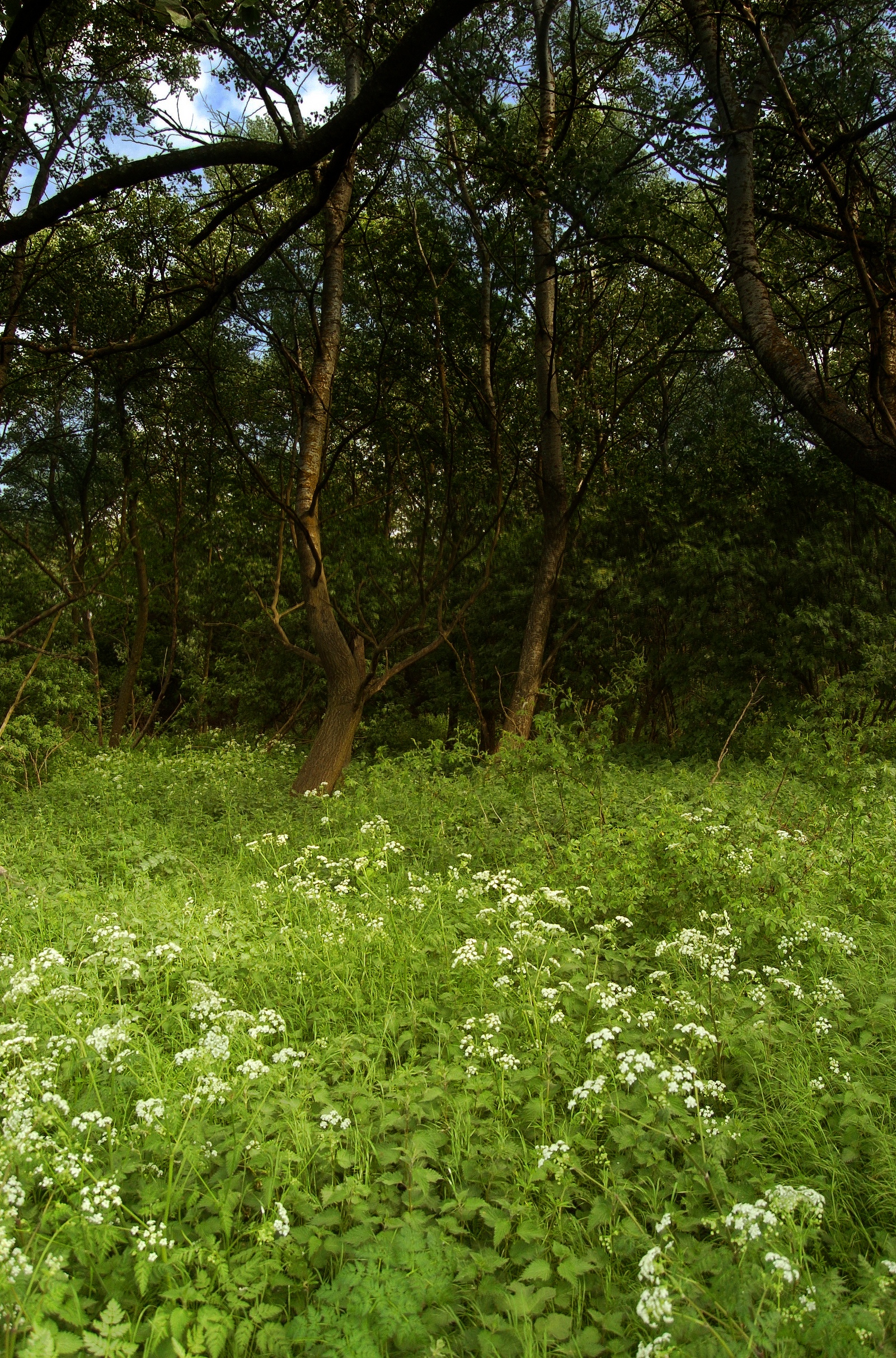
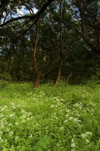
The unsharp mask is used for sharpening, but exactly the same mathematics can be used to add a nice punch to a photo. Here's our sample shot (and if you don't have a photo of your own to play with, you can download the high-resolution version here):
I love this shot. I don't mind saying so because I didn't take it; someone who is better than me snapped this with my D2H (and kindly let me use it here). Still, I think it needs a bit of a contrast kick, so let's go to Filters -> Enhance -> Unsharp Mask...:
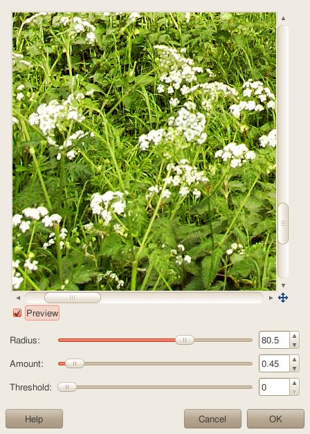
You'll notice that I've resized the window to make it bigger; that's because you can't really tell how it's affecting contrast if you're looking at it full-sized. Anyway, I've entered 80.5 for "Radius" and 0.45 for "Amount". You'll want to adjust your radius to taste, and for the resolution of your camera. To get exactly the same result on your shots, remember that my file was 2425 pixels on its longest edge. Your camera will likely have more than this, so increase it accordingly. (If it's 5000 pixels, for example, set "Radius" to about 160.)
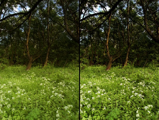
Here's what you get with these settings:
Be careful with this; if you set "Amount" too high, under the wrong circumstances you'll end up with big ugly halos around things.
Thanks to Ken Rockwell (pbuh) for teaching me this trick.
The same chick who took the tree picture above also taught me the following trick, which looks great for the right shots. It makes shadows dark like film and brings white to white, and has the effect of neutralising colour casts, too!
Let's start with this:

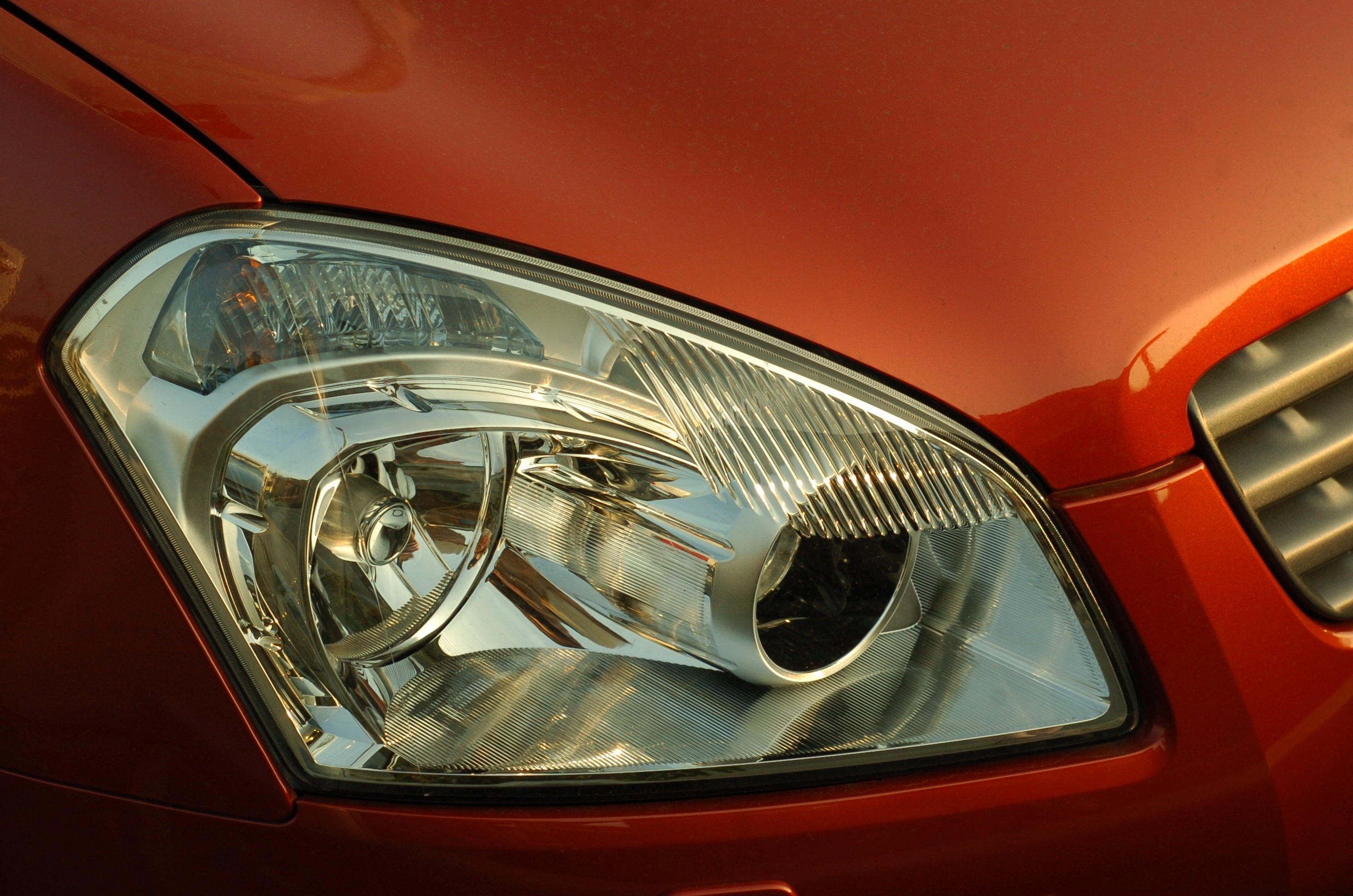
I snapped this on the way home from doing something else; I passed a car dealer and liked the simple lines and strong colours. Let's play with this (and here's the high-resolution file if you want to play with mine). Bring up your layers dialog (Windows -> Dockable Dialogs -> Layers:
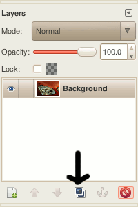
Hit the duplicate layer button (indicated by a crude arrow above). Then pick "Soft light" from the the "Mode:" drop-down box. You'll notice contrast in your image will increase to an ugly and undesirable amount, but ignore this. Next, go to the Colors -> Desaturate... menu, which gives you this window:
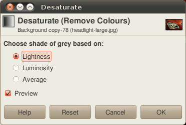
Which of the options ("Lightness" vs "Luminosity" vs "Average") you choose is up to you. Try all three; I picked "Average" because it looked better. Hit "OK", and you'll end up with this:
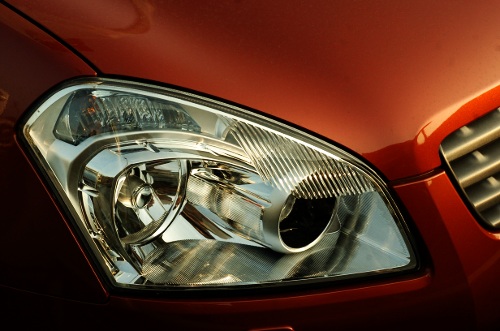
Awesome! It works great for this shot, because it gets the contrasts where I want them: murky shadows like film, without losing highlight detail. You might want to play with the opacity slider in the layers dialog to get it to look right. It doesn't work for all my shots, and it might not work for whatever you're photographing, but it's one of many spoons in your photography cutlery draw.
Colors -> Auto -> White Balance sometimes works fine as a quick-and-dirty fix. It also sometimes looks nasty. Try it.
Another quick-and-dirty one is the Levels tool (Colors -> Levels), which gives you something like this:
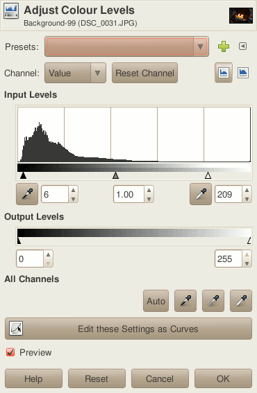
Note that I've moved the little arrows underneath the histogram at the top. Moving the leftmost arrow towards the right makes shadows darker. Moving the rightmost one towards the left will make highlights brighter. Do both and you're increasing contrast. Simples!
Real photographers (I just play one on the Internet) would stab me if I mentioned levels without mentioning curves, so here's something about curves (Colors -> Curves):
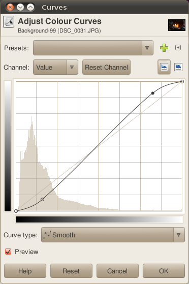
The line is usually straight, but look at how I've curved it. On the bottom left part of the line, the closer to the bottom it is, the darker colours will get. The closer to the horizontal centre it is, the greater range of luminances that are pushed to black. The opposite is true for highlights (the top right of the curve): as you push the curve to the top, the brighter things get, and as you move it to the centre horizontally, a greater range of luminances are pushed lighter.
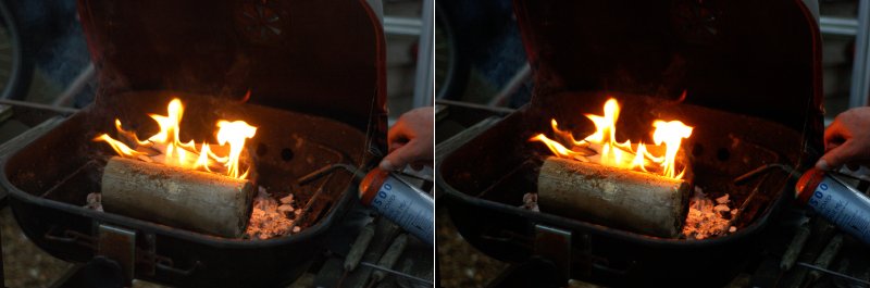
That's an awful explanation and I'm not sure it makes sense, but it's easy to see the effect as you're doing it. Here's how the above curve worked on a family snapshot. (Yup, my family snapshots typically include blowtorches or some other dangerous object; that's the kind of family I have. The can of liquid with which we were experimenting, marked "HIGHLY FLAMMABLE", is just out of shot.)
Smart people will happily use any combination of the methods I've mentioned on this page.
Upping contrast doesn't add noise, but it can make any noise that is there more visible. That's just how it is. Up the contrasts to extremes and you'll see banding and other nasty artifacts.
Myself, I'd much rather see a noisy picture with the contrasts in the right place than a flat-but-super-clean photo.