from Shutter, by Lewis Collard
This page is a subpage of my review of Darktable.
TL;DR: turn the "Saturation" control to zero for much better results than the default.
When I take photographs which have a clear subject, I like to dim the corners a little to bring attention to the subject. This is called vignetting. It's easy to do right if you know what to do, and just as easy to do wrong if you don't. It's easy to spot someone who has just discovered this trick, because they'll invariably over-do it such that it looks like they took a photo with a Holga. (I'm not gonna judge! I've been guilty of it too!)
Darktable has a very flexible module for doing vignettes. Its defaults do it wrong.
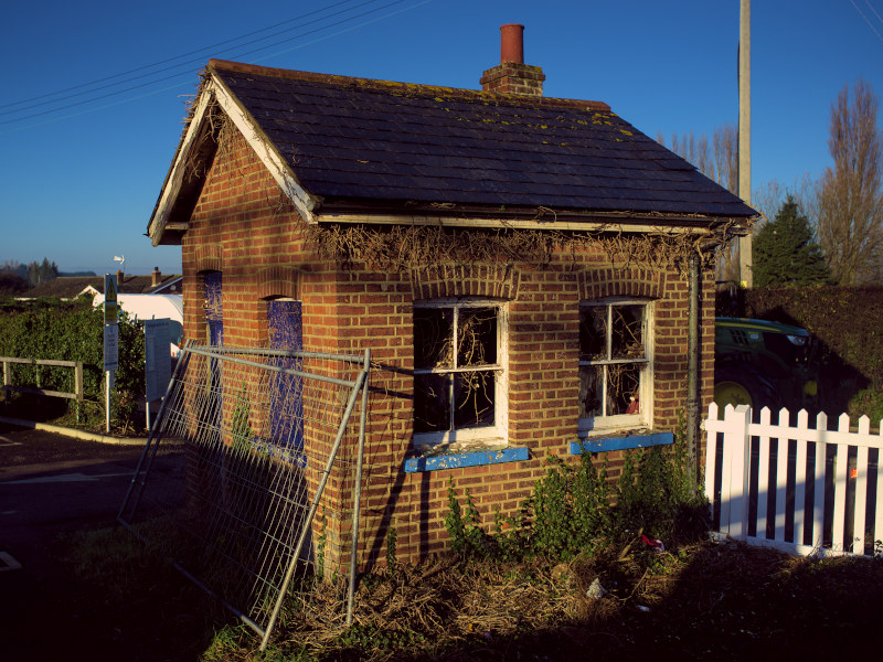
I don't like boring test shots, so we can use this boring photo of a building instead. As it happens, there is some natural dimming of the corners already; this is natural falloff from the lens of the X100 which took the photo. Still, with something close to Darktable's default vignette settings, let's apply a vignette to attempt to make this more interesting.
Now, if you pay close attention, you can see that the corners have dimmed. If you're really paying attention, you will notice that colour saturation in the corners has been reduced too. The dark blue sky is now greyer in the corners.
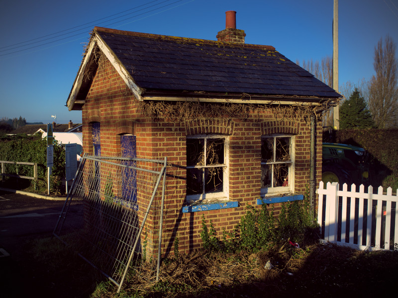
I think this looks terrible and artificial. If you notice it, then it's being overdone! Let's turn Darktable's "Saturation" control for this module to zero, to remove this saturation falloff:

In my opinion, that looks far better! The brightness fall-off is the same, but the blue gets darker rather than heading to grey.
Unlike some lesser photo editing tools, Darktable's vignette module is much smarter than a simple reduced-opacity black overlay. It just doesn't look very much that way with its default settings, and those default settings don't look very good to me.
This is personal taste! I share my own opinions, not just because they're great, but also because they're the only ones I'm an expert in. You should feel free to use what looks good to you.
Psst: as you're the only person who has ever read this far, I'll let you in on a secret: you can click or tap the original image at the top of this page to see it with and without vignetting too! Tell me if you think I over-did it.